MOBILE APP + WEB
Wayfarer
Nov. 2023
Landing page and mobile app design for a travel company.
Timeline
1 Week
Tools Used
Figma
Photoshop
Team
Solo Project
Scope
UX/UI Design
Problem
Wayfarer is a place for travelers to discover new locations to visit around the world. Although it doesn’t directly sell any trips, flights, or accommodation on the site, people use it as a tool for researching where to travel next, based on their preferences.
Solution
Create an inviting and explorative experience that allows users to search locations and share reviews.
Landing Page
Traveling is an emotional activity. It triggers specific responses in people and I wanted to create a website that made users feel good about exploring and learning about new destinations. I wanted it to feel as travelling should— less clutter, more discovery. For both the website and mobile app, I chose orange as the primary color for two reasons: one being the explorative nature of the color itself and secondly it contrasted nicely to the greens and blues found in a lot of travel photos.
Mobile App
Part of the request was to create high fidelity mockups for a login screen, an explore page, and an individual destination page.

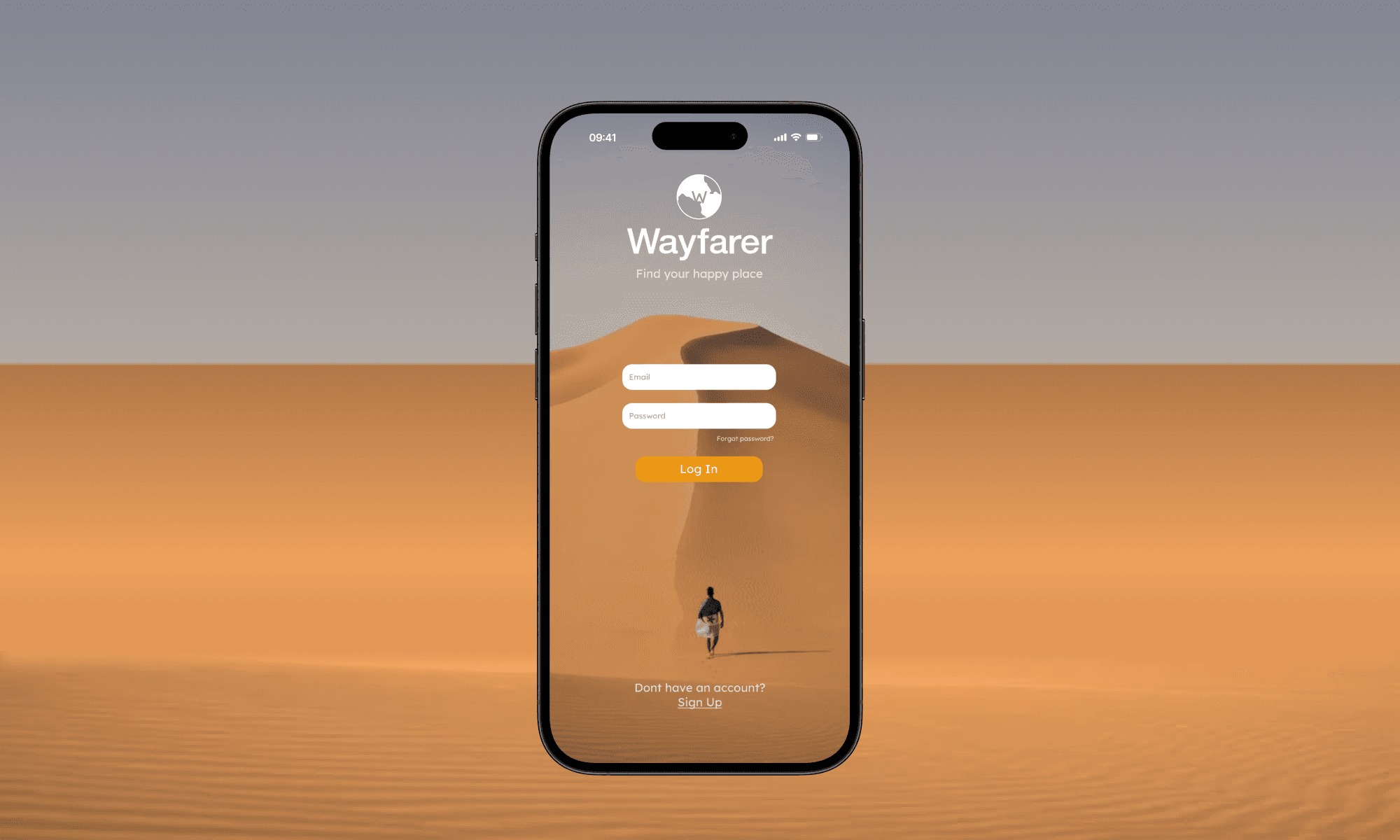
Login Screen
Login screens are one of favorite parts of an experience to design. It sets the tone for what's to come and in this case its planning a journey. I want the user to embody the emotions of the traveler heading to their destination.
Explore Page
The explore page should serve as a simple way to discover new destinations so to mitigate the clutter I added a navbar for simple browsing. The focus is on exploring images and reviews, not distracting features. If a user wants to know more, they can tap into it and view the individual destination page.
Destination Page
Tapping into a destination will give the user an overview, reviews, hotels and more. Keep in mind, Wayfarer is not a booking company so the emphasis is always on discovery and learning. Providing users with the knowledge they need to make the best decision is the ultimate goal.
Logo Sketching
I designed the logo to incorporate some sort of globe along with the 'W'. I sketched around, played around with different vectors and eventually landed on something that scaled well, was distinguishable, and would look good in black and white.
Conclusion
Building a travel website and app was a fun challenge because I've never created anything in the travel industry before. It was a great exercise to learn how to keep things simple while keeping the focus on areas that matter.
I love tying digital and real life experiences together and finding their overlaps. Discovering new destinations digitally should function and feel similarly to discovering new destinations in the real world. Enlightening, fun, therapeutic, you name it. I think the designs I came up with help tie the two nicely.
MOBILE APP + WEB
Wayfarer
Nov. 2023
Landing page and mobile app design for a travel company.
Timeline
1 Week
Tools Used
Figma
Photoshop
Team
Solo Project
Scope
UX/UI Design
Problem
Wayfarer is a place for travelers to discover new locations to visit around the world. Although it doesn’t directly sell any trips, flights, or accommodation on the site, people use it as a tool for researching where to travel next, based on their preferences.
Solution
Create an inviting and explorative experience that allows users to search locations and share reviews.
Landing Page
Traveling is an emotional activity. It triggers specific responses in people and I wanted to create a website that made users feel good about exploring and learning about new destinations. I wanted it to feel as travelling should— less clutter, more discovery. For both the website and mobile app, I chose orange as the primary color for two reasons: one being the explorative nature of the color itself and secondly it contrasted nicely to the greens and blues found in a lot of travel photos.
Mobile App
Part of the request was to create high fidelity mockups for a login screen, an explore page, and an individual destination page.
Login Screen
Login screens are one of favorite parts of an experience to design. It sets the tone for what's to come and in this case its planning a journey. I want the user to embody the emotions of the traveler heading to their destination.
Explore Page
The explore page should serve as a simple way to discover new destinations so to mitigate the clutter I added a navbar for simple browsing. The focus is on exploring images and reviews, not distracting features. If a user wants to know more, they can tap into it and view the individual destination page.
Destination Page
Tapping into a destination will give the user an overview, reviews, hotels and more. Keep in mind, Wayfarer is not a booking company so the emphasis is always on discovery and learning. Providing users with the knowledge they need to make the best decision is the ultimate goal.
Logo Sketching
I designed the logo to incorporate some sort of globe along with the 'W'. I sketched around, played around with different vectors and eventually landed on something that scaled well, was distinguishable, and would look good in black and white.
Conclusion
Building a travel website and app was a fun challenge because I've never created anything in the travel industry before. It was a great exercise to learn how to keep things simple while keeping the focus on areas that matter.
I love tying digital and real life experiences together and finding their overlaps. Discovering new destinations digitally should function and feel similarly to discovering new destinations in the real world. Enlightening, fun, therapeutic, you name it. I think the designs I came up with help tie the two nicely.
MOBILE APP + WEB
Wayfarer
Nov. 2023
Landing page and mobile app design for a travel company.
Timeline
1 week
Tools Used
Figma
Photoshop
Team
Solo Project
Scope
UX/UI Design
Problem
Wayfarer is a place for travelers to discover new locations to visit around the world. Although it doesn’t directly sell any trips, flights, or accommodation on the site, people use it as a tool for researching where to travel next, based on their preferences.
Solution
Create an inviting and explorative experience that allows users to search locations and share reviews.
Landing Page
Traveling is an emotional activity. It triggers specific responses in people and I wanted to create a website that made users feel good about exploring and learning about new destinations. I wanted it to feel as travelling should— less clutter, more discovery. For both the website and mobile app, I chose orange as the primary color for two reasons: one being the explorative nature of the color itself and secondly it contrasted nicely to the greens and blues found in a lot of travel photos.
Mobile App
Part of the request was to create high fidelity mockups for a login screen, an explore page, and an individual destination page.
Login Screen
Login screens are one of favorite parts of an experience to design. It sets the tone for what's to come and in this case its planning a journey. I want the user to embody the emotions of the traveler heading to their destination.
Explore Page
The explore page should serve as a simple way to discover new destinations so to mitigate the clutter I added a navbar for simple browsing. The focus is on exploring images and reviews, not distracting features. If a user wants to know more, they can tap into it and view the individual destination page.
Destination Page
Tapping into a destination will give the user an overview, reviews, hotels and more. Keep in mind, Wayfarer is not a booking company so the emphasis is always on discovery and learning. Providing users with the knowledge they need to make the best decision is the ultimate goal.
Logo Sketching
I designed the logo to incorporate some sort of globe along with the 'W'. I sketched around, played around with different vectors and eventually landed on something that scaled well, was distinguishable, and would look good in black and white.
Conclusion
Building a travel website and app was a fun challenge because I've never created anything in the travel industry before. It was a great exercise to learn how to keep things simple while keeping the focus on areas that matter.
I love tying digital and real life experiences together and finding their overlaps. Discovering new destinations digitally should function and feel similarly to discovering new destinations in the real world. Enlightening, fun, therapeutic, you name it. I think the designs I came up with help tie the two nicely.
More Work