feature CONCEPT
Apple Music
Oct 31, 2023


Optimizing the experience of an existing app to allow for more flexibility and customization.
Timeline
1 Week
Tools Used
Figma
Photoshop
Maze
Team
Solo Project
Scope
UX/UI Design
Problem
Sifting through playlists on Apple Music is often cumbersome and there’s no ability to filter or sort songs in a customized way. A user might have hundreds of songs in a playlist, all of different genres and artists and albums, however, there is no option to assign personal tags to each song and filter or sort the playlist to only listen to specific songs.
Solution
Convert Apples existing macOs tag system into a seamless iOS experience that is intuitive and noninvasive to the current Apple Music application.
How it Works
I wanted the process to be as seamless as possible and fit nicely into Apple Music's existing elements. The features I added live in the current dropdown options in the app and function as they do on macOS to keep a consistent experience across the Apple ecosystem.
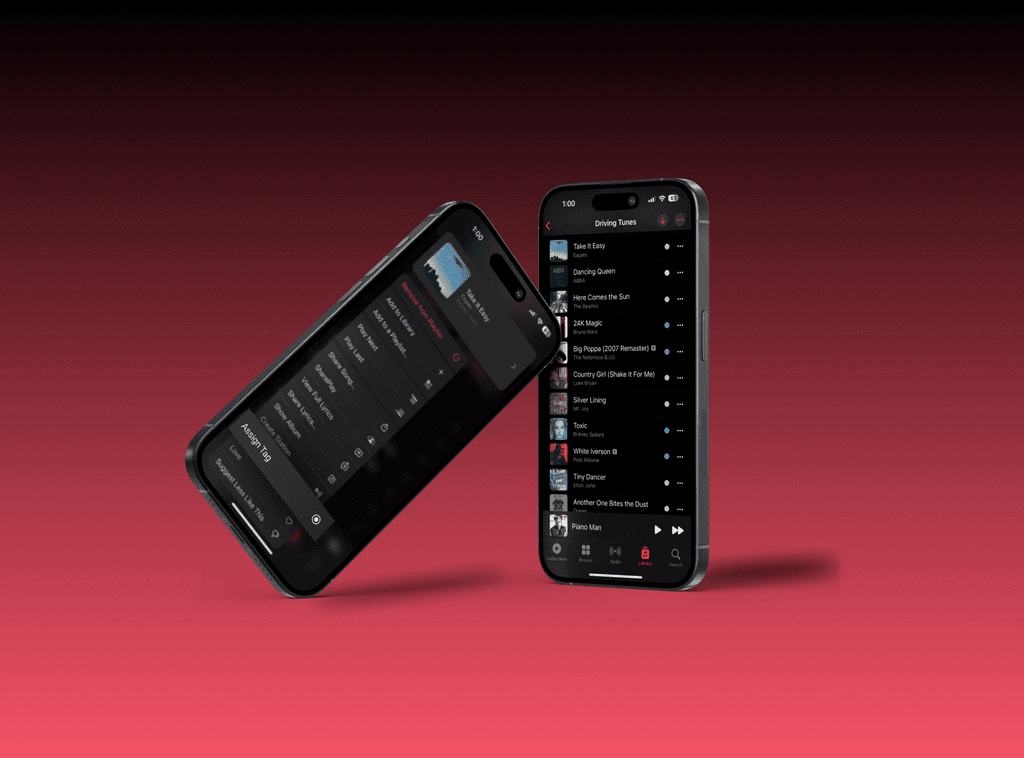
Adding Tags
In this example, I'm adding tags to my driving playlist. Sometimes there are songs that fit a certain vibe or genre and you only want to listen to those songs within the playlist. This is a simple way to add a visual element that enhances the experience.
Filtering Tags
Once you have a tag added, not only do you have a simple visual cue while you're scrolling through your playlists, but I added the ability to filter the playlist by tag so you can listen to a specific set of songs within your playlist.
Sorting Tags
Because the sort feature already existed, it made sense to include tags as an option along with artist, title and release date.
macOS Tags
While the flow I created is a light mobile conversion, tags on macOS are a prominent feature. I imagine the tag flow will operate similarly for all Apple products in the future. I recreated the components from macOS and adjusted them to fit the Apple Music's scheme. Below is how they are currently used on desktop.

Right clicking on any file allows you to add a tag.
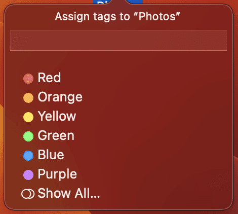
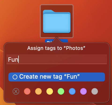
Users can select preset color tags or create their own.
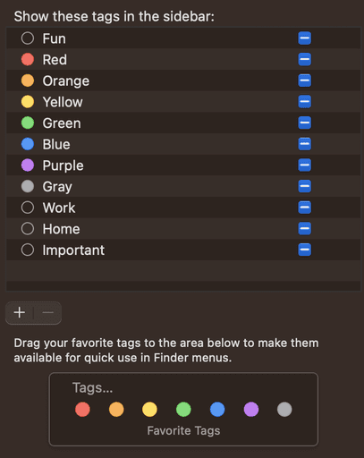
Tags have their own settings in the finder and can be edited easily.
Conversion
I created a simple component set to help translate the tag experience from macOS to Apple Music. I wanted it to look and function the same in its new home.
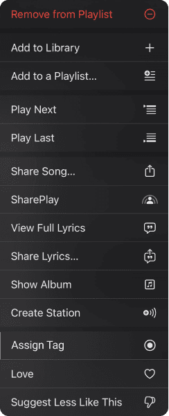
I added the 'Assign Tag' button to the section that already included sentimental options like the 'Love' button.
Apple has it's own Tags icon, though I didn't feel it was totally appropriate in this context so I created one I thought fit better.

Preset color options should function identically while custom tags should be easy to create within a smaller viewport.


For the sort dropdown, I simply added 'Tag' as an option.
For the Filter dropdown, I mimicked the sort dropdown and added other realistic filters along with Apples filter icon for consistency.
Conclusion
Apple Music has a ton of great features and as a daily user I challenged myself to enhance the existing design. It was great to learn how to work within such a successful ecosystem and understand the intricacies of the product.
I have a ton of playlists with varying genres and vibes so I always find myself sifting through playlists for specific songs based on the mood I'm in. This felt like the perfect solution- it's simple, intuitive, effective and consistent with the Apple ecosystem, both on mobile and web. I would love to see something like this implemented in the future. Apple, your move (hire me).
feature CONCEPT
Apple Music
Oct 31, 2023
Optimizing the experience of an existing app to allow for more flexibility and customization.
Timeline
1 Week
Tools Used
Figma
Photoshop
Maze
Team
Solo Project
Scope
UX/UI Design
Problem
Sifting through playlists on Apple Music is often cumbersome and there’s no ability to filter or sort songs in a customized way. A user might have hundreds of songs in a playlist, all of different genres and artists and albums, however, there is no option to assign personal tags to each song and filter or sort the playlist to only listen to specific songs.
Solution
Convert Apples existing macOs tag system into a seamless iOS experience that is intuitive and noninvasive to the current Apple Music application.
How it Works
I wanted the process to be as seamless as possible and fit nicely into Apple Music's existing elements. The features I added live in the current dropdown options in the app and function as they do on macOS to keep a consistent experience across the Apple ecosystem.
Adding Tags
In this example, I'm adding tags to my driving playlist. Sometimes there are songs that fit a certain vibe or genre and you only want to listen to those songs within the playlist. This is a simple way to add a visual element that enhances the experience.
Filtering Tags
Once you have a tag added, not only do you have a simple visual cue while you're scrolling through your playlists, but I added the ability to filter the playlist by tag so you can listen to a specific set of songs within your playlist.
Sorting Tags
Because the sort feature already existed, it made sense to include tags as an option along with artist, title and release date.
macOS Tags
While the flow I created is a light mobile conversion, tags on macOS are a prominent feature. I imagine the tag flow will operate similarly for all Apple products in the future. I recreated the components from macOS and adjusted them to fit the Apple Music's scheme. Below is how they are currently used on desktop.
Right clicking on any file allows you to add a tag.
Users can select preset color tags or create their own.
Tags have their own settings in the finder and can be edited easily.
Conversion
I created a simple component set to help translate the tag experience from macOS to Apple Music. I wanted it to look and function the same in its new home.
I added the 'Assign Tag' button to the section that already included sentimental options like the 'Love' button.
Apple has it's own Tags icon, though I didn't feel it was totally appropriate in this context so I created one I thought fit better.
Preset color options should function identically while custom tags should be easy to create within a smaller viewport.
For the sort dropdown, I simply added 'Tag' as an option.
For the Filter dropdown, I mimicked the sort dropdown and added other realistic filters along with Apples filter icon for consistency.
Conclusion
Apple Music has a ton of great features and as a daily user I challenged myself to enhance the existing design. It was great to learn how to work within such a successful ecosystem and understand the intricacies of the product.
I have a ton of playlists with varying genres and vibes so I always find myself sifting through playlists for specific songs based on the mood I'm in. This felt like the perfect solution- it's simple, intuitive, effective and consistent with the Apple ecosystem, both on mobile and web. I would love to see something like this implemented in the future. Apple, your move (hire me).
More Work
feature CONCEPT
Apple Music
Oct 31, 2023
Optimizing the experience of an existing app to allow for more flexibility and customization.
Timeline
1 Week
Tools Used
Figma
Photoshop
Maze
Team
Solo Project
Scope
UX/UI Design
Problem
Sifting through playlists on Apple Music is often cumbersome and there’s no ability to filter or sort songs in a customized way. A user might have hundreds of songs in a playlist, all of different genres and artists and albums, however, there is no option to assign personal tags to each song and filter or sort the playlist to only listen to specific songs.
Solution
Convert Apples existing macOs tag system into a seamless iOS experience that is intuitive and noninvasive to the current Apple Music application.
How it Works
I wanted the process to be as seamless as possible and fit nicely into Apple Music's existing elements. The features I added live in the current dropdown options in the app and function as they do on macOS to keep a consistent experience across the Apple ecosystem.
Adding Tags
In this example, I'm adding tags to my driving playlist. Sometimes there are songs that fit a certain vibe or genre and you only want to listen to those songs within the playlist. This is a simple way to add a visual element that enhances the experience.
Filtering Tags
Once you have a tag added, not only do you have a simple visual cue while you're scrolling through your playlists, but I added the ability to filter the playlist by tag so you can listen to a specific set of songs within your playlist.
Sorting Tags
Because the sort feature already existed, it made sense to include tags as an option along with artist, title and release date.
macOS Tags
While the flow I created is a light mobile conversion, tags on macOS are a prominent feature. I imagine the tag flow will operate similarly for all Apple products in the future. I recreated the components from macOS and adjusted them to fit the Apple Music scheme. Below is how they are currently used on desktop.
Right clicking on any file allows you to add a tag.
Users can select preset color tags or create their own.
Tags have their own settings in the finder and can be edited easily.
Conversion
I created a simple component set to help translate the tag experience from macOS to Apple Music. I wanted it to look and function the same in its new home.
I added the 'Assign Tag' button to the section that already included sentimental options like the 'Love' button.
Apple has it's own Tags icon, though I didn't feel it was totally appropriate in this context so I created one I thought fit better.
Preset color options should function identically while custom tags should be easy to create within a smaller viewport.
For the sort dropdown, I simply added 'Tag' as an option.
For the Filter dropdown, I mimicked the sort dropdown and added other realistic filters along with Apples filter icon for consistency.
Conclusion
Apple Music has a ton of great features and as a daily user I challenged myself to enhance the existing design. It was great to learn how to work within such a successful ecosystem and understand the intricacies of the product.
I have a ton of playlists with varying genres and vibes so I always find myself sifting through playlists for specific songs based on the mood I'm in. This felt like the perfect solution- it's simple, intuitive, effective and consistent with the Apple ecosystem, both on mobile and web. I would love to see something like this implemented in the future.
More Work